Revit Families Explained: Key Types, Applications, and Emerging Trends for 2025
How Building Information Modeling is Powering Green Buildings and Eco-Friendly Construction in 2025

The world is a vibrant tapestry of colors, and understanding how these colors interact with each other is a powerful tool. Whether you’re a designer, artist, or simply someone who appreciates a well-coordinated outfit, the color wheel is your key to unlocking harmonious color combinations.
Imagine a circular map, where each region represents a different color. This is the color wheel, a foundational concept in color theory. It typically displays 12 hues, with primary colors (red, yellow, and blue) positioned at equal distances from each other. Secondary colors (orange, green, and purple) are created by mixing primary colors, and their placement reflects this origin. The remaining spaces are filled with tertiary colors, formed by blending a primary and a neighboring secondary color.
The true magic of the color wheel lies in its ability to guide us toward pleasing color combinations. Different color harmonies evoke distinct moods and can be strategically used to achieve a desired effect. Here’s a breakdown of some popular color harmonies:
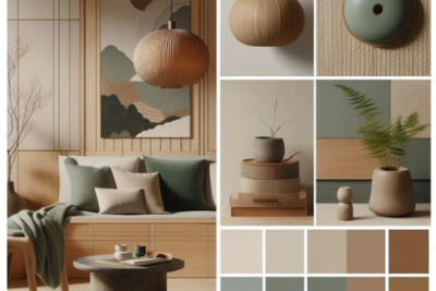
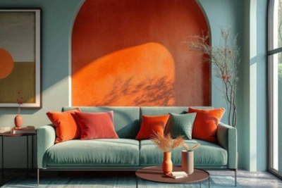
The color wheel offers more than just color placement. Each color has a perceived temperature – reds, yellows, and oranges are considered warm, while blues, greens, and purples are considered cool. Understanding temperature can help you create a balanced palette. For example, a warm living room might benefit from cooler accent colors to create a sense of balance.


We often underestimate the power of color. It’s everywhere, from the clothes we wear to the walls of our homes, and it has a profound impact on how we feel. Understanding this connection between color and emotion can be a game-changer, allowing you to make intentional choices that influence your mood and the message you convey.


Color psychology is a fascinating field that explores the link between colors and human emotions. It’s not just about personal preference; certain colors have been shown to trigger specific reactions in most people. Let’s delve into some key colors and their emotional associations:
Color choices can significantly impact various aspects of our lives:


Color isn’t just about individual hues; consider the impact of shades, tones, and saturation. A pastel blue will create a different mood than a deep navy. Remember, cultural contexts also play a role. Red might symbolize good luck in China but danger in some Western cultures.


Harness the power of color by following these tips:


Color is a powerful language. By understanding the impact of colors and emotions, you can make informed choices that not only influence your own mood but also create specific atmospheres and effectively communicate your message. So, the next time you choose a color, consider the feeling you want to evoke. Let your colors speak volumes.


How Building Information Modeling is Powering Green Buildings and Eco-Friendly Construction in 2025
![BIM MEP Online Course with Autodesk Certification - Learn Revit, Get Certified & Build Your Portfolio [2025]](https://augmintech.com/wp-content/uploads/2025/09/BIM-MEP-Online-Course-with-Autodesk-Certification-Learn-Revit-Get-Certified-Build-Your-Portfolio-2025-1-scaled.webp)
How Building Information Modeling is Powering Green Buildings and Eco-Friendly Construction in 2025

How Building Information Modeling is Powering Green Buildings and Eco-Friendly Construction in 2025